Client
![]()

Client Info
A fintech start up PointCard focused on building a balanced financial future that aligns incentives between people and their payment cards.
A fintech start up PointCard focused on building a balanced financial future that aligns incentives between people and their payment cards.
Project Name
Design System Deck (Titan)
Design System Deck (Titan)
Problem
As the app continues to grow in robustness, both the design and engineering teams recognized the need for a definitive source of truth encompassing typography, layout, color codes, icon specifics, and other essential design elements. Red-lining every screen has proven to be inefficient and time-consuming. Fortunately, we have already established a design system that can address these challenges more effectively.
Asks
Solution
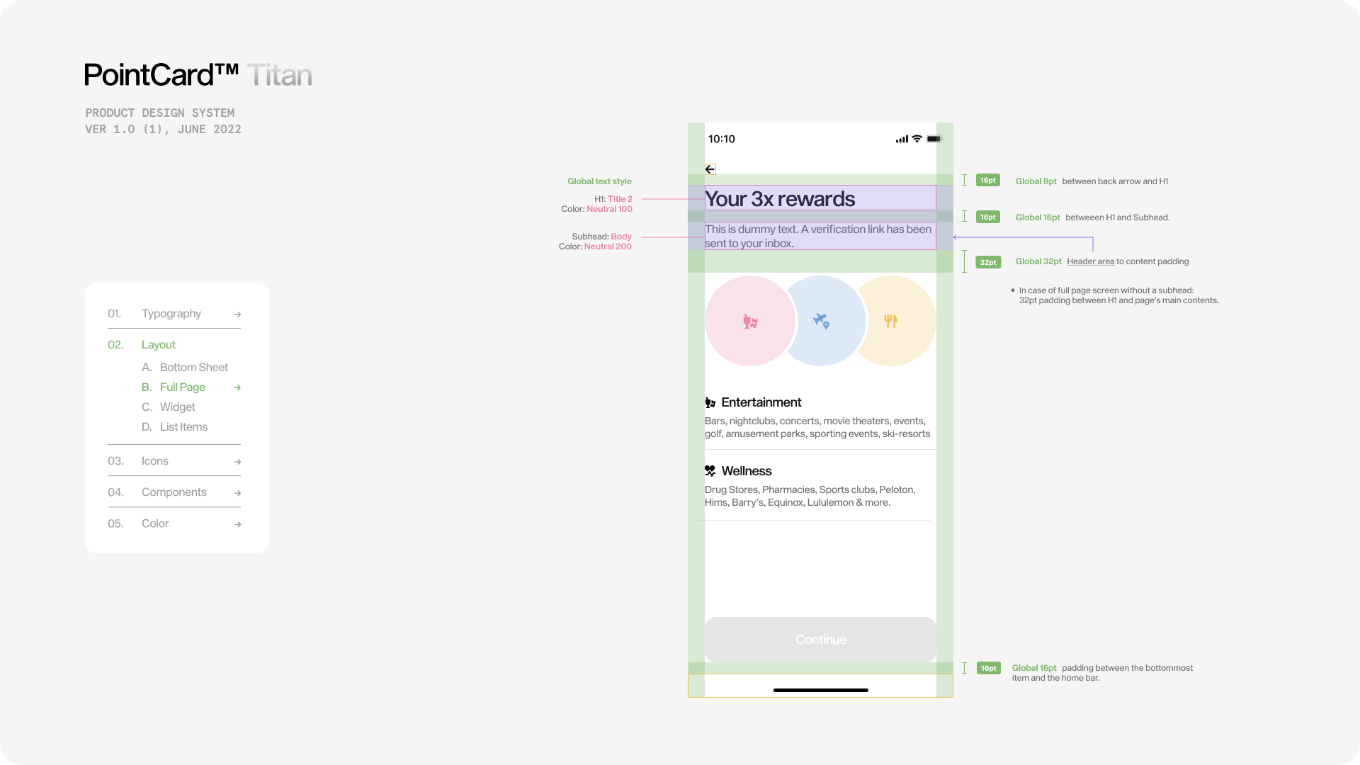
To incorporate Titan app's visual appeal, I aimed to create a cohesive and widget-like style for the presentation deck, essentially transforming it into a "giant widget." A significant challenge with traditional presentation decks is the need to click through numerous slides to find specific information. To address this, I introduced a convenient sticky menu on the left side of the deck. This menu allows users to navigate effortlessly between categories and subcategories, making it easier to locate desired information quickly.
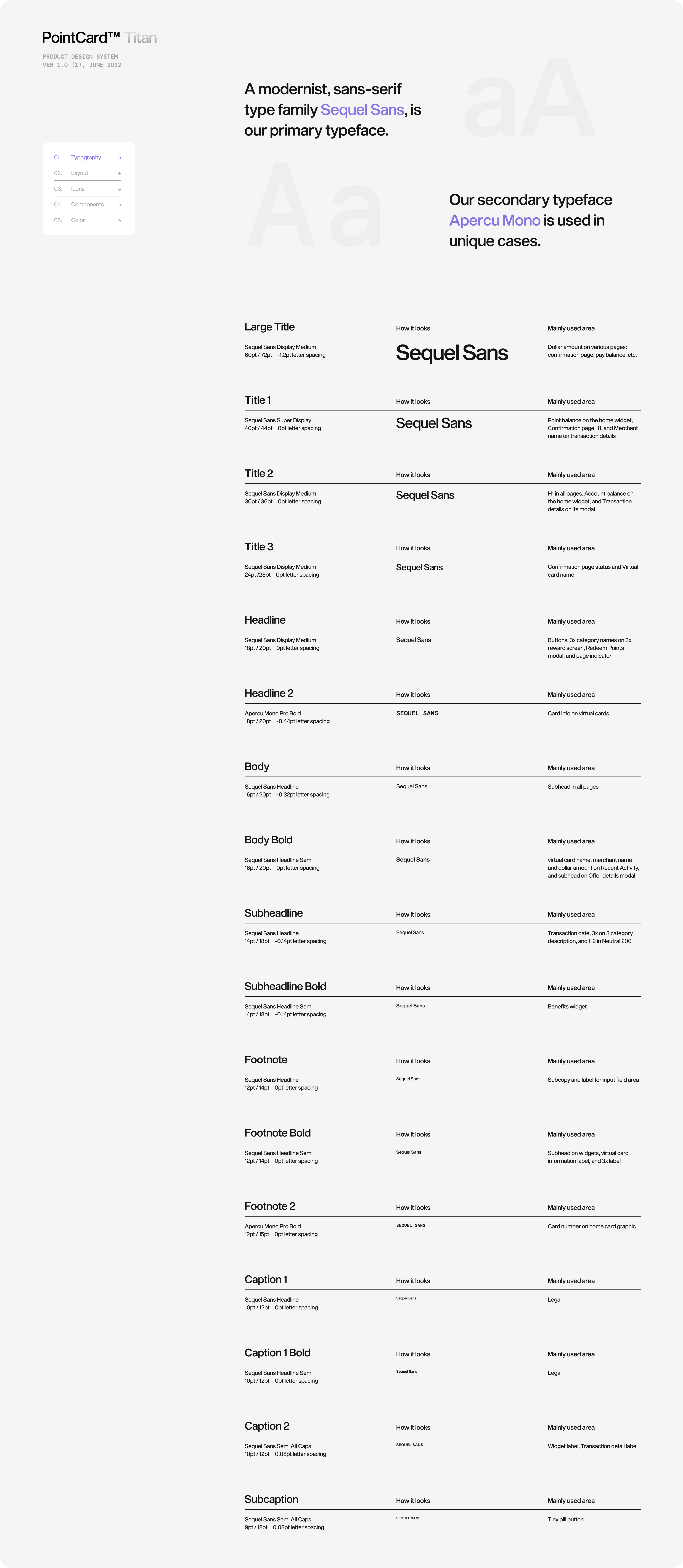
Additionally, I made certain screens scrollable, ensuring that all related information remains accessible within a single screen. This improvement streamlines the user experience, making the deck more efficient and user-friendly.
As the app continues to grow in robustness, both the design and engineering teams recognized the need for a definitive source of truth encompassing typography, layout, color codes, icon specifics, and other essential design elements. Red-lining every screen has proven to be inefficient and time-consuming. Fortunately, we have already established a design system that can address these challenges more effectively.
Asks
- Showcase the entire array of our existing design system.
- Embrace a "more details, the better" approach.
- Make it fun.
Solution
To incorporate Titan app's visual appeal, I aimed to create a cohesive and widget-like style for the presentation deck, essentially transforming it into a "giant widget." A significant challenge with traditional presentation decks is the need to click through numerous slides to find specific information. To address this, I introduced a convenient sticky menu on the left side of the deck. This menu allows users to navigate effortlessly between categories and subcategories, making it easier to locate desired information quickly.
Additionally, I made certain screens scrollable, ensuring that all related information remains accessible within a single screen. This improvement streamlines the user experience, making the deck more efficient and user-friendly.

